The Apple Box
Building a Flexible System for Menus and Packaging
ROLE: Graphic Designer
CLIENT: The Apple Box
INDUSTRY: Food & Hospitality
MEDIUM: Packaging & Print Design
SCOPE: Packaging Design, Menu Design, Information Design, Print Production
The Apple Box needed a cohesive system for its growing range of prepared foods, menus, and in-store materials that could make products easy to identify while maintaining the warm, local character of the brand.
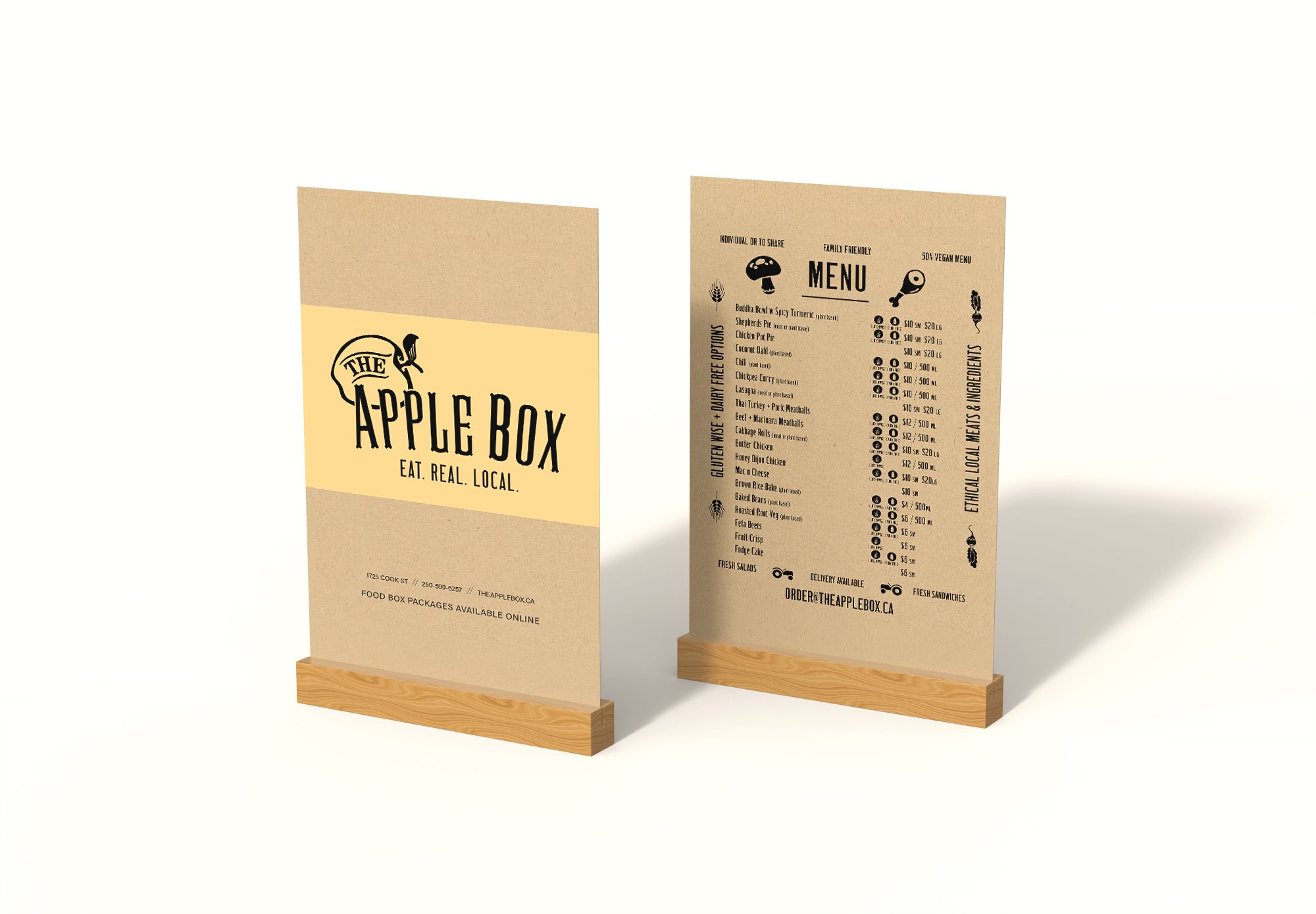
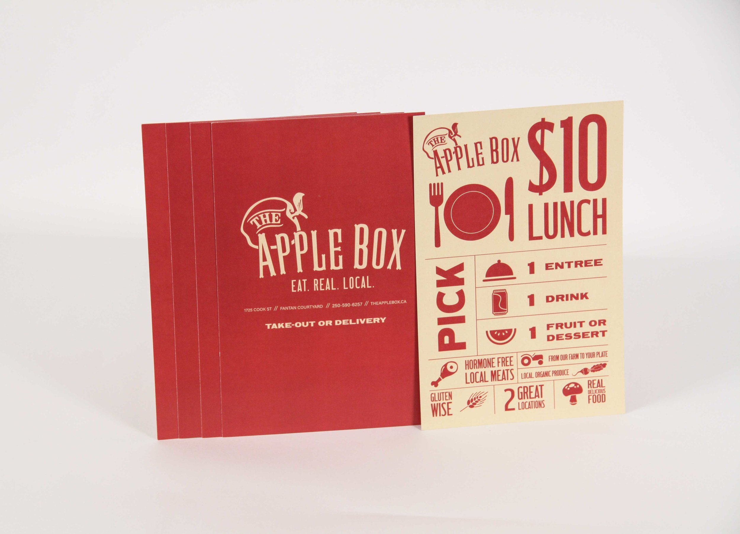
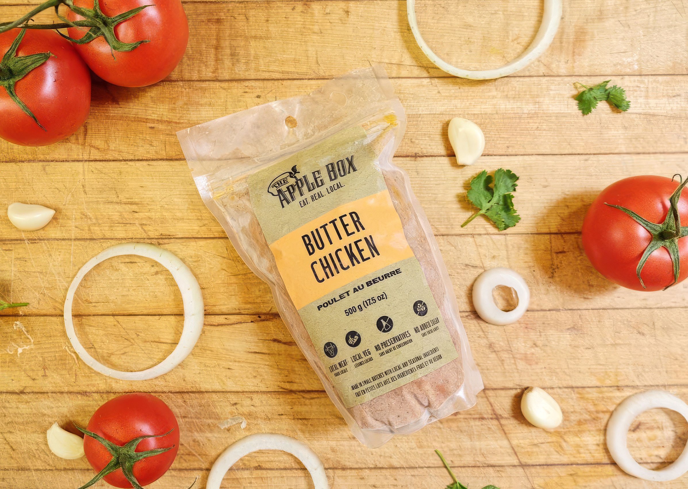
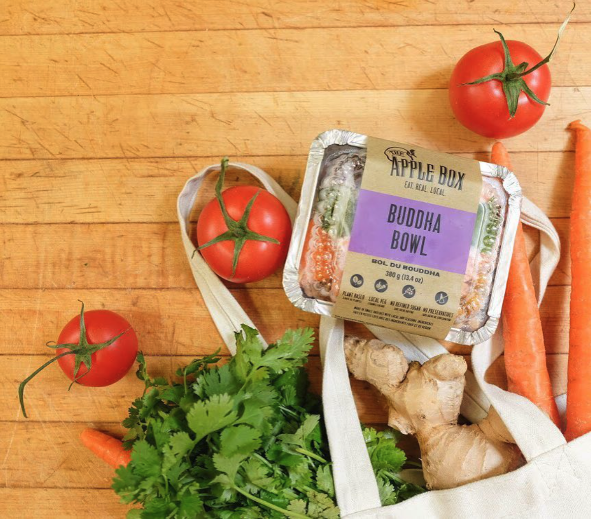
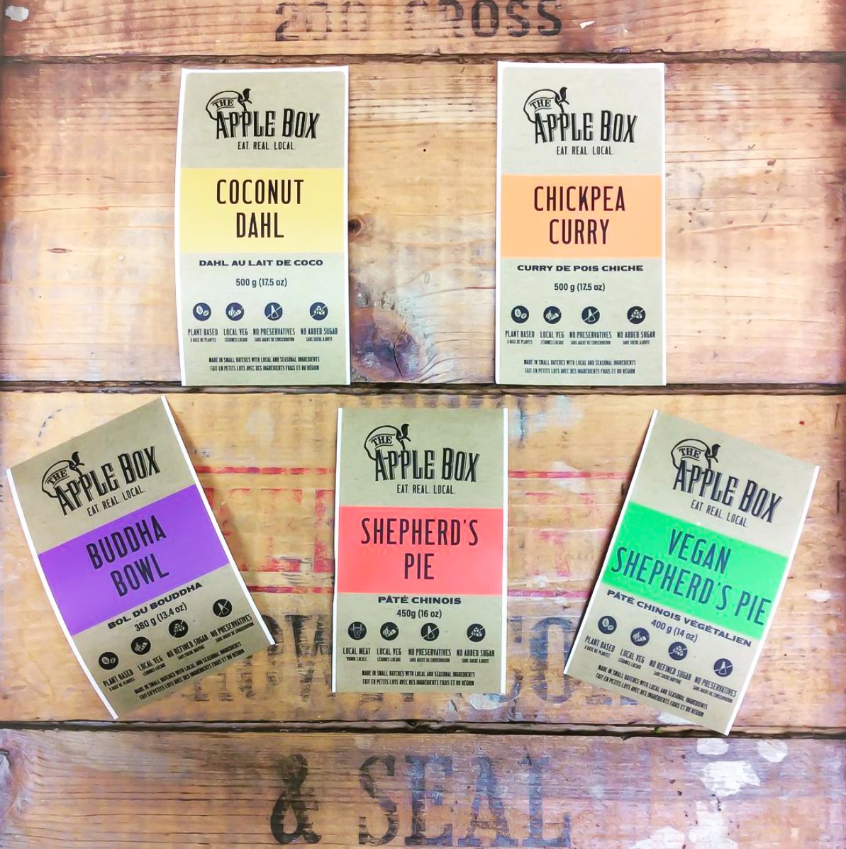
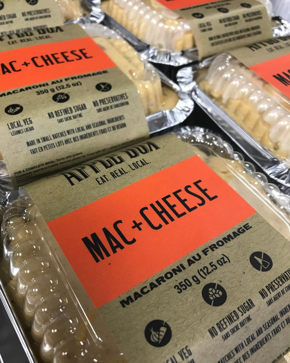
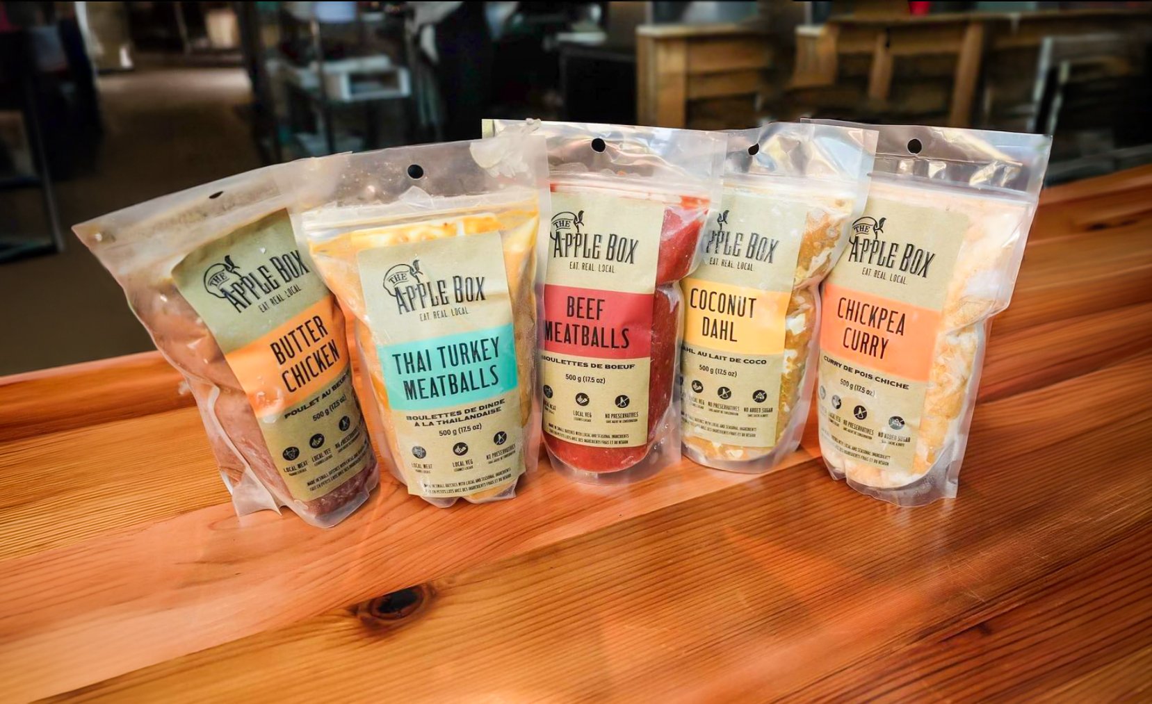
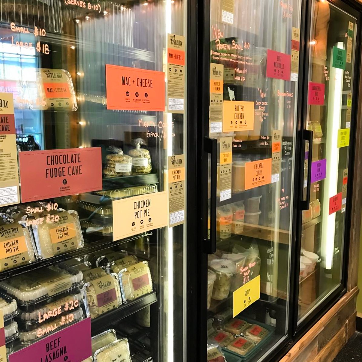
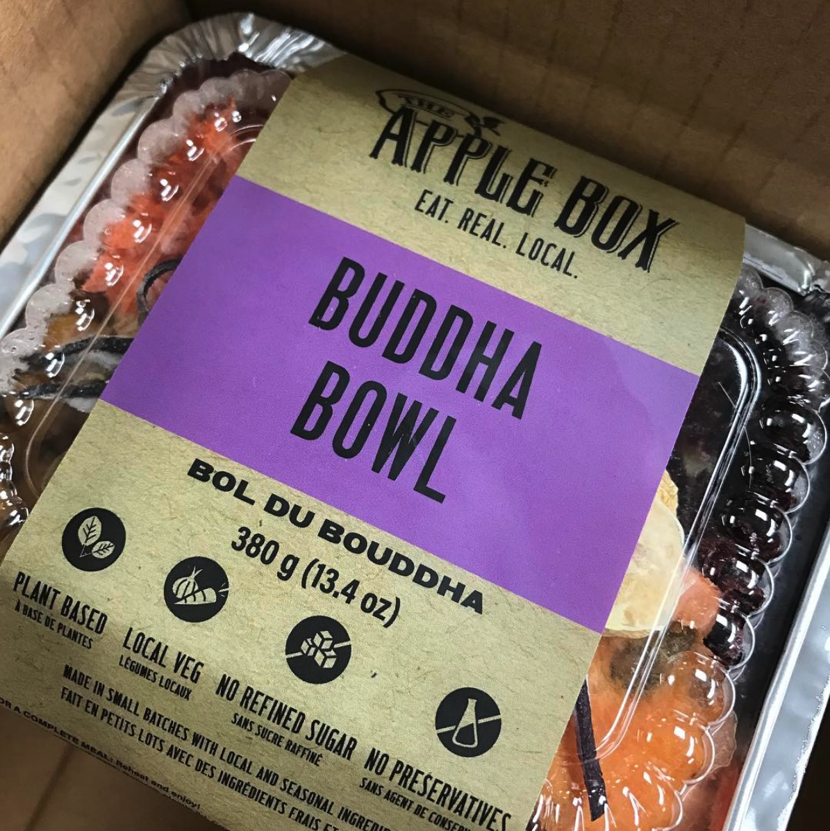
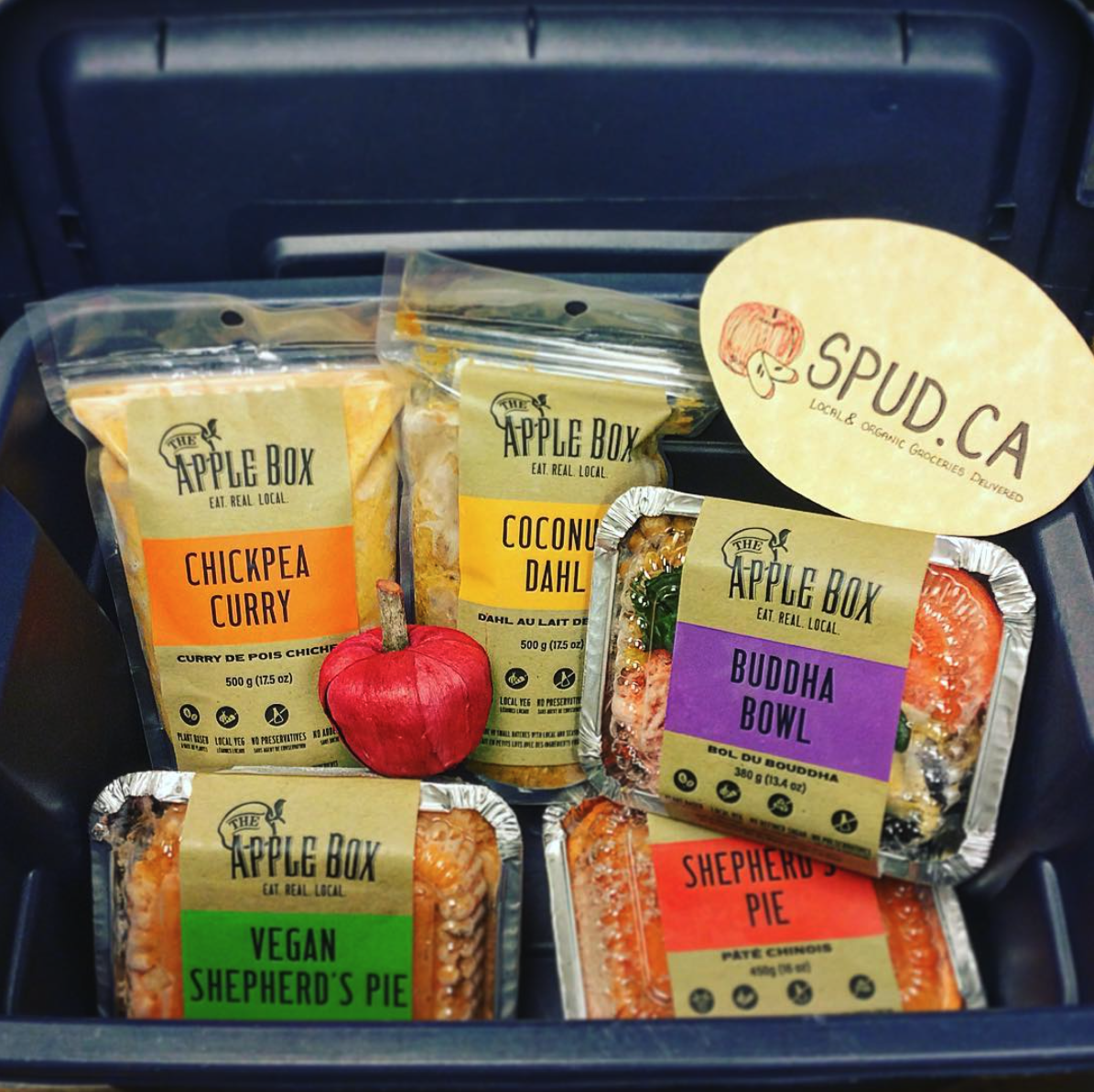
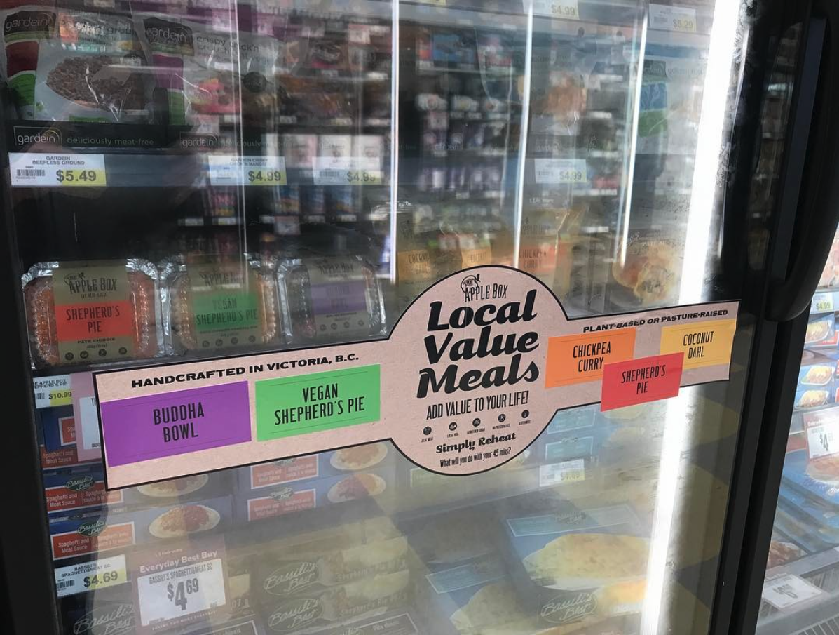
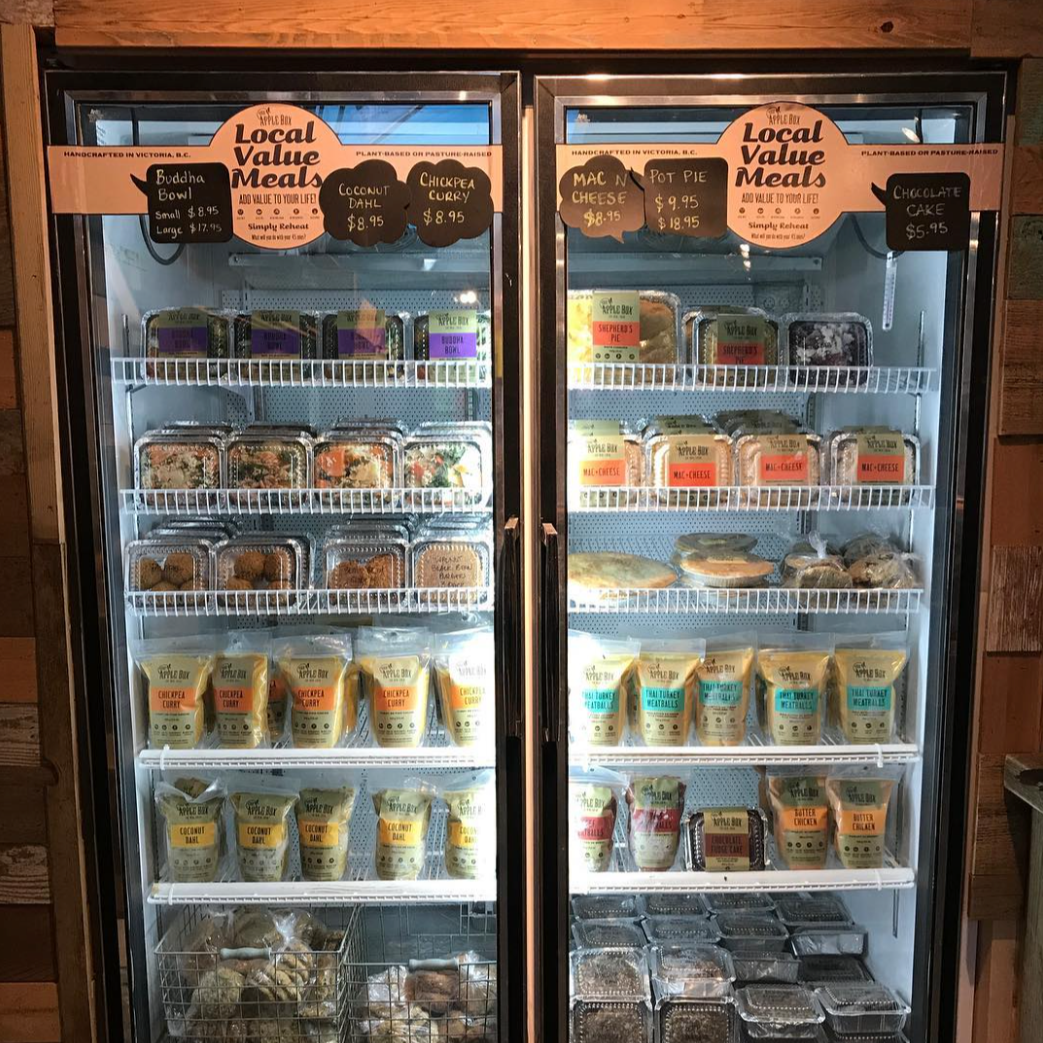
The work needed to function across a wide range of formats, from individual food labels and refrigerated displays to printed menus and promotional pieces. With many products, dietary attributes, bilingual information, and different package sizes to accommodate, the challenge was to create a system that stayed consistent without becoming repetitive or difficult to scan.
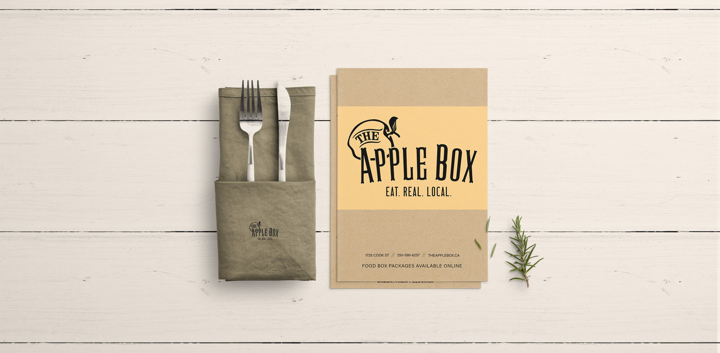
I developed a flexible visual approach built around kraft-paper textures, bold typography, simple icons, and colour-coded product categories. Bright accent colours helped distinguish individual dishes at a glance, while a consistent hierarchy made product names, dietary information, weights, and other details easy to find. The same visual language extended into menus and in-store collateral, creating a recognizable system across the customer experience.